We were tasked to redesign a website of a government agency. Together, my classmate and I collaborated on user research and heuristic analyses of the current Department of the Interior website. From there, I worked individually on card sorting, site mapping, wireframing, visual design and creating hi-fidelity prototypes for mobile and desktop.
Project Type: Responsive Web Design
My Role: UX Researcher, UX Designer, UI Designer
Research Collaborator: Jeremiah Forster
Timeline: 3 Weeks
Tools: Figma
The Department of the Interior website is overwhelming with the amount of information and there is no clear call to action on the site.
Conduct user research to determine frustrations/pain points and how the DOI site can be improved. Redesign a website that is less overwhelming and has an efficient navigation.
Research & Analysis
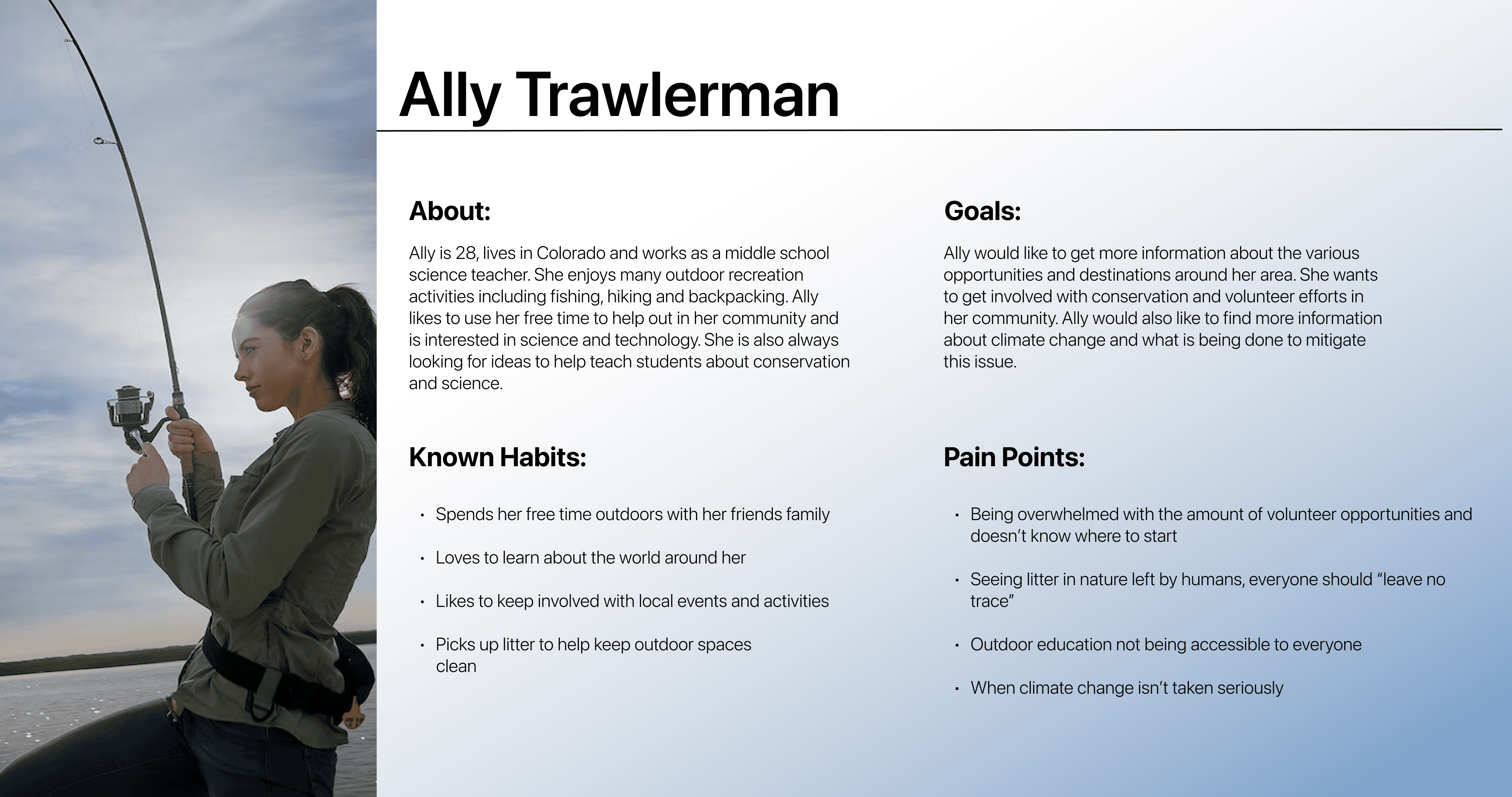
Proto-Persona
The proto-persona helped us identify reasons why someone would visit the Department of the Interior so we can look through the eyes of a potential user and determine what aspects need a redesign.
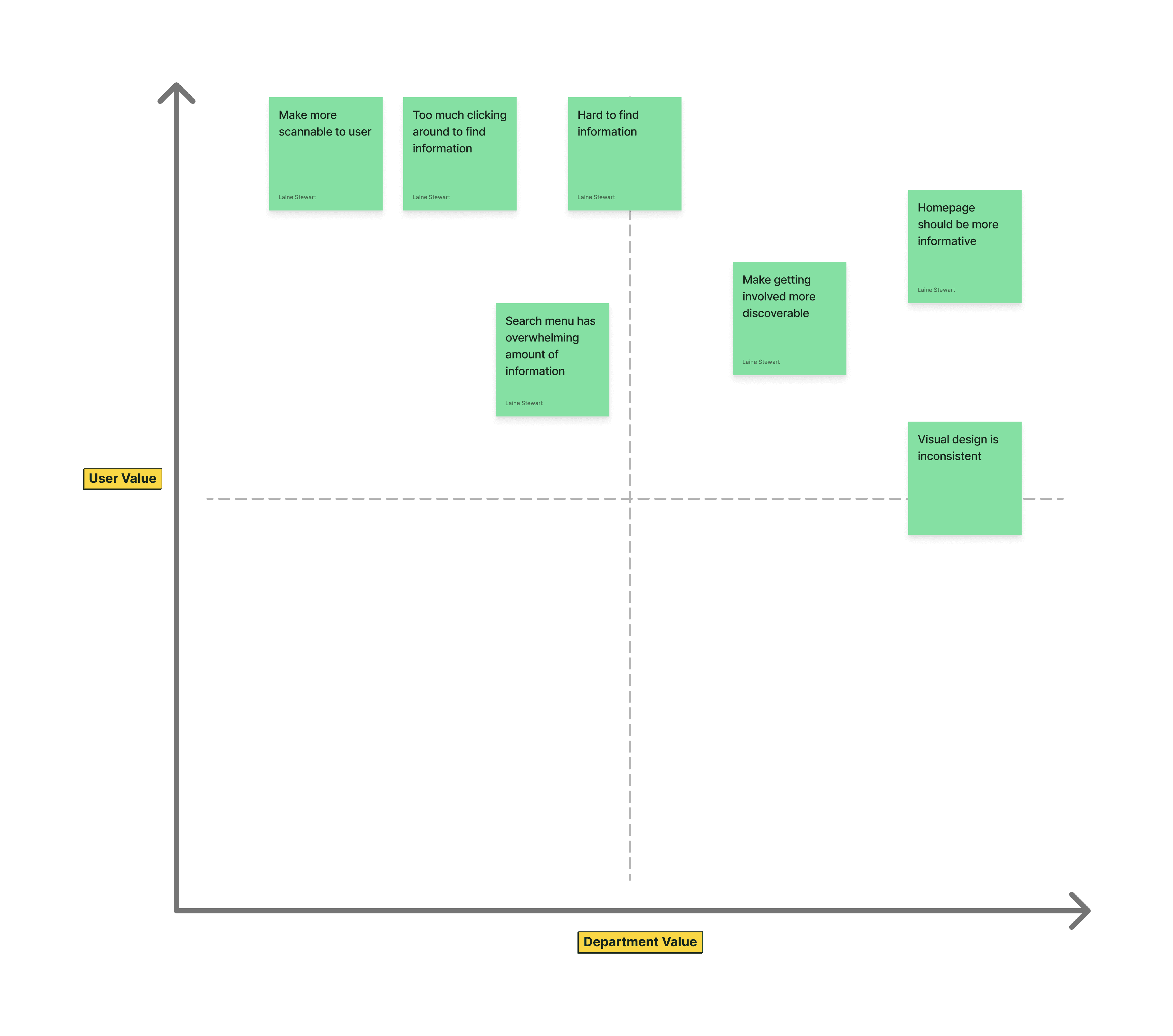
To gain more insight, we conducted user testings on the current Department of the Interior website. Throughout the testing, we learned that many users had frustrations with finding specific information they were looking for. The Department of the Interior website is jam-packed with information and some users even gave up when things got too overwhelming. When arranging user notes into the prioritization matrix, it was clear that most issues users came across would either be of value to the user or the Department of the Interior.
Here are the main findings from the user testings:
Information is not scannable
Use of browser back button to navigate
Inconsistent design
Homepage should be more informative
Make getting involved more discoverable
Difficult to find information
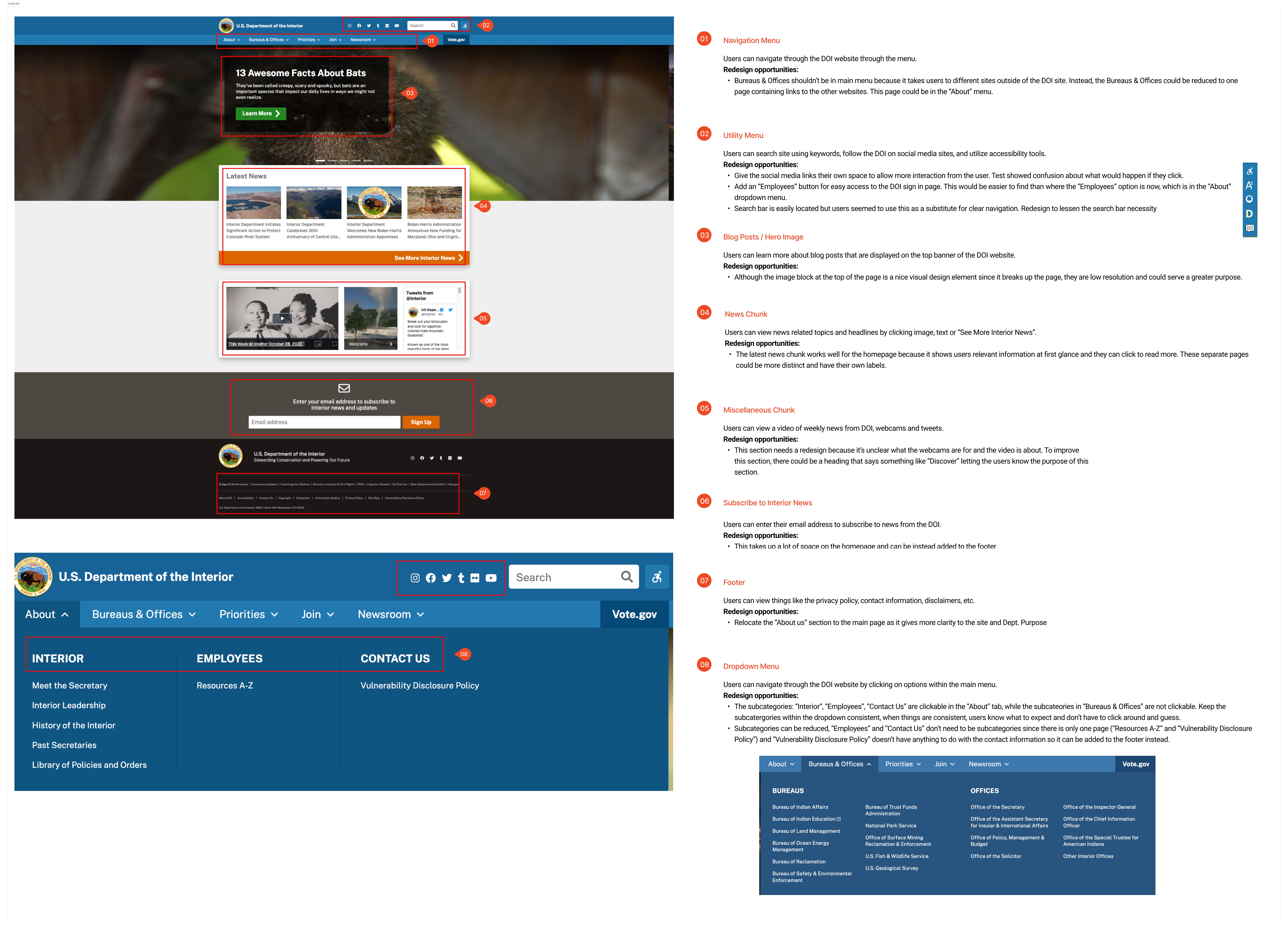
We analyzed the navigation of the current DOI site and found several redesign opportunities that would be worth implementing. One of the focuses I had when analyzing is making things more visible to the user. For example, the “Employees” option is hidden in the “About” menu, and it doesn’t make sense for that category. An “Employees Login” option might make more sense in the utility menu so users don’t have to search for the employee portal. We also focused a lot on consistency because it’s important that the user knows what to expect.
Card Sorting & Site Mapping
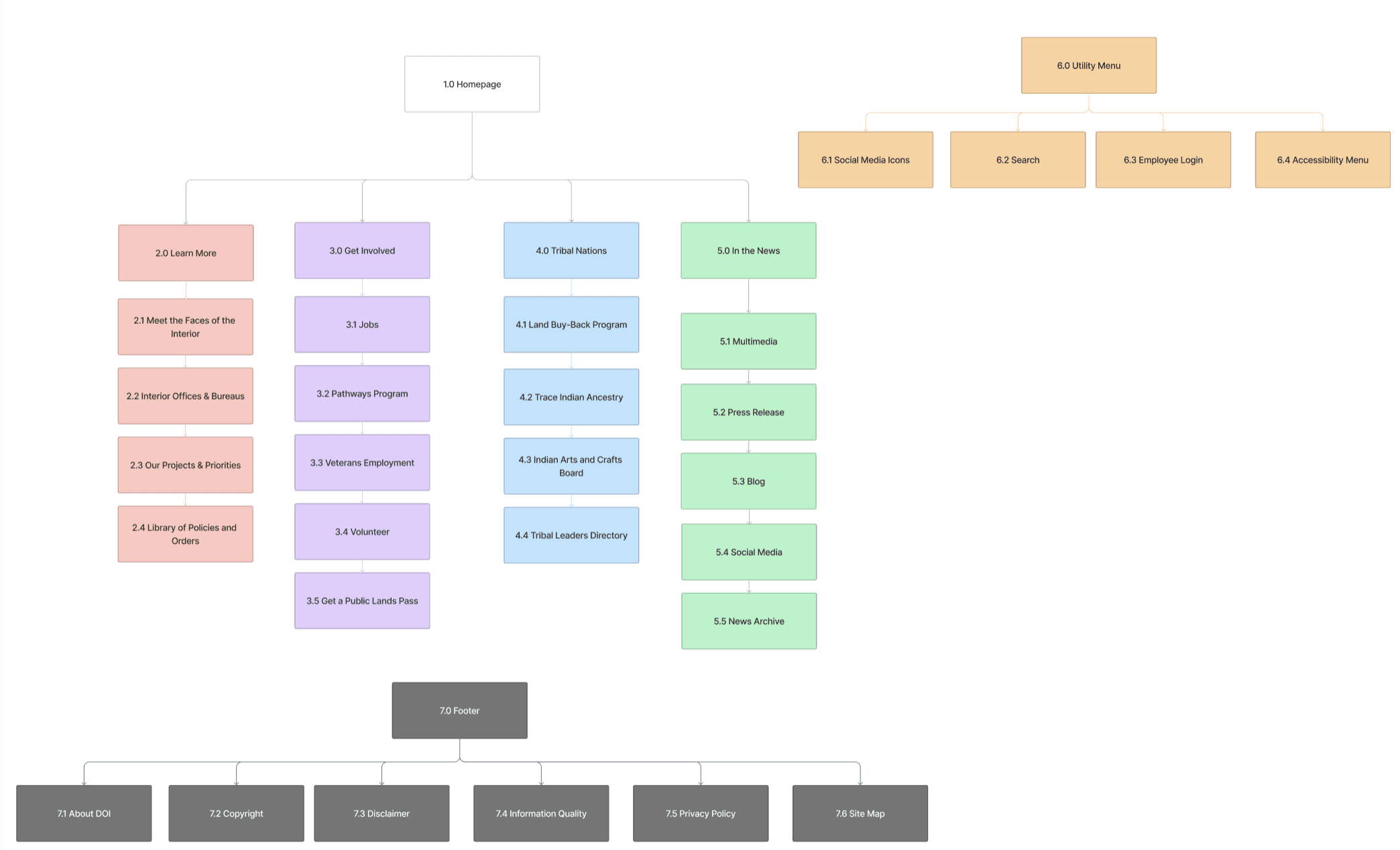
Before getting into the visual design, I sorted menu items in the current DOI navigation. This step in the process was difficult because there is so much information on the DOI website and sometimes the information is hard to categorize. I had to assess what could be taken out/added. After conducting user tests during the wireframing process, 4 out of 5 users mentioned there being too many options within the navigation menu categories, especially in the “Learn More” menu. I had to revisit the card sorting and make iterations.
After reorganizing the categories, I created a new site map:
Definition & Wireframing
User Testing
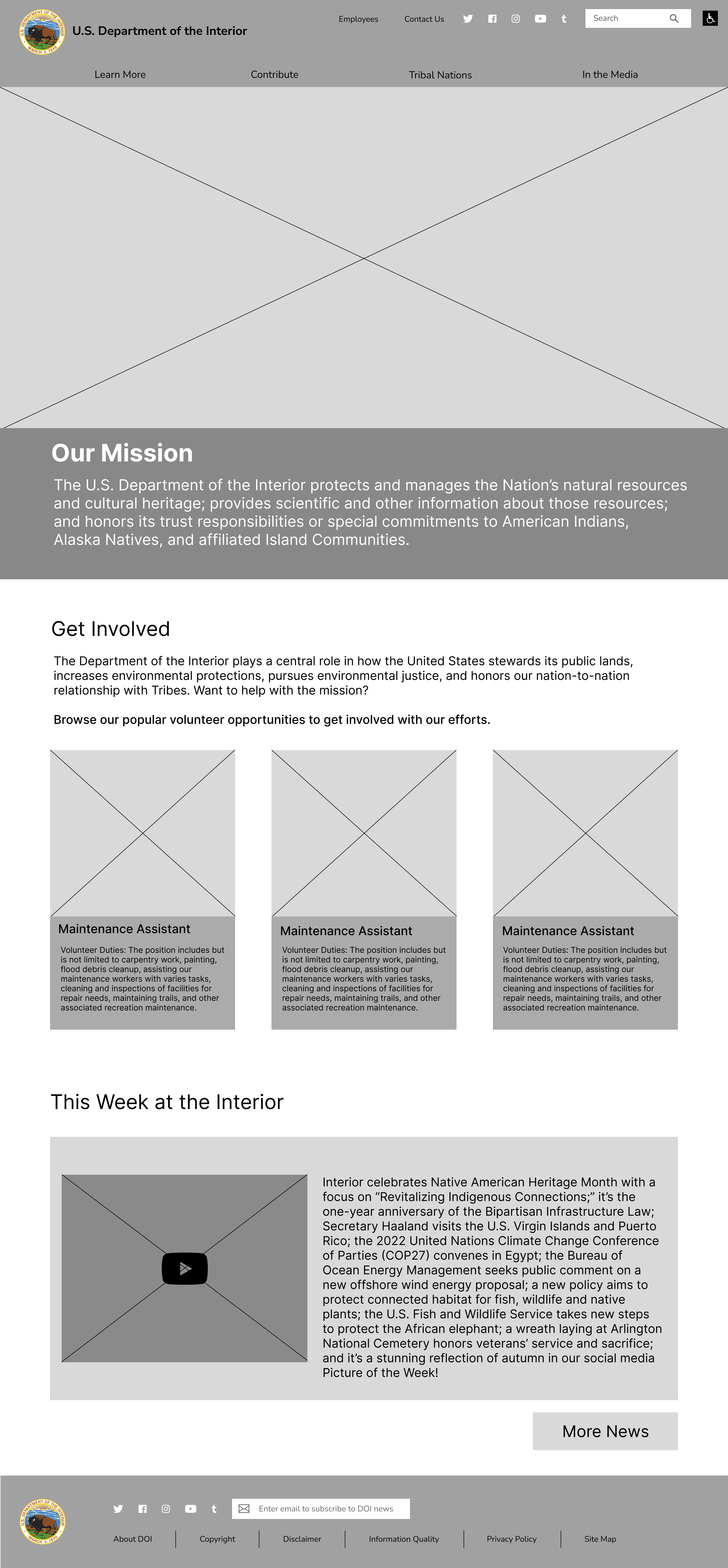
After creating the wireframe prototype, user testings were conducted to discover what improvements can be made before implementing visual elements such as color and imagery.
Here are some main takeaways:
Contribute label in navigation is confusing, maybe change to “Get Involved” or “Opportunities”
There are a lot of things in “Learn More” menu, could be overwhelming
Homepage looks too wordy and cluttered
Was expecting social media icons to be at the bottom of page
Visual Design
UI Style Guide
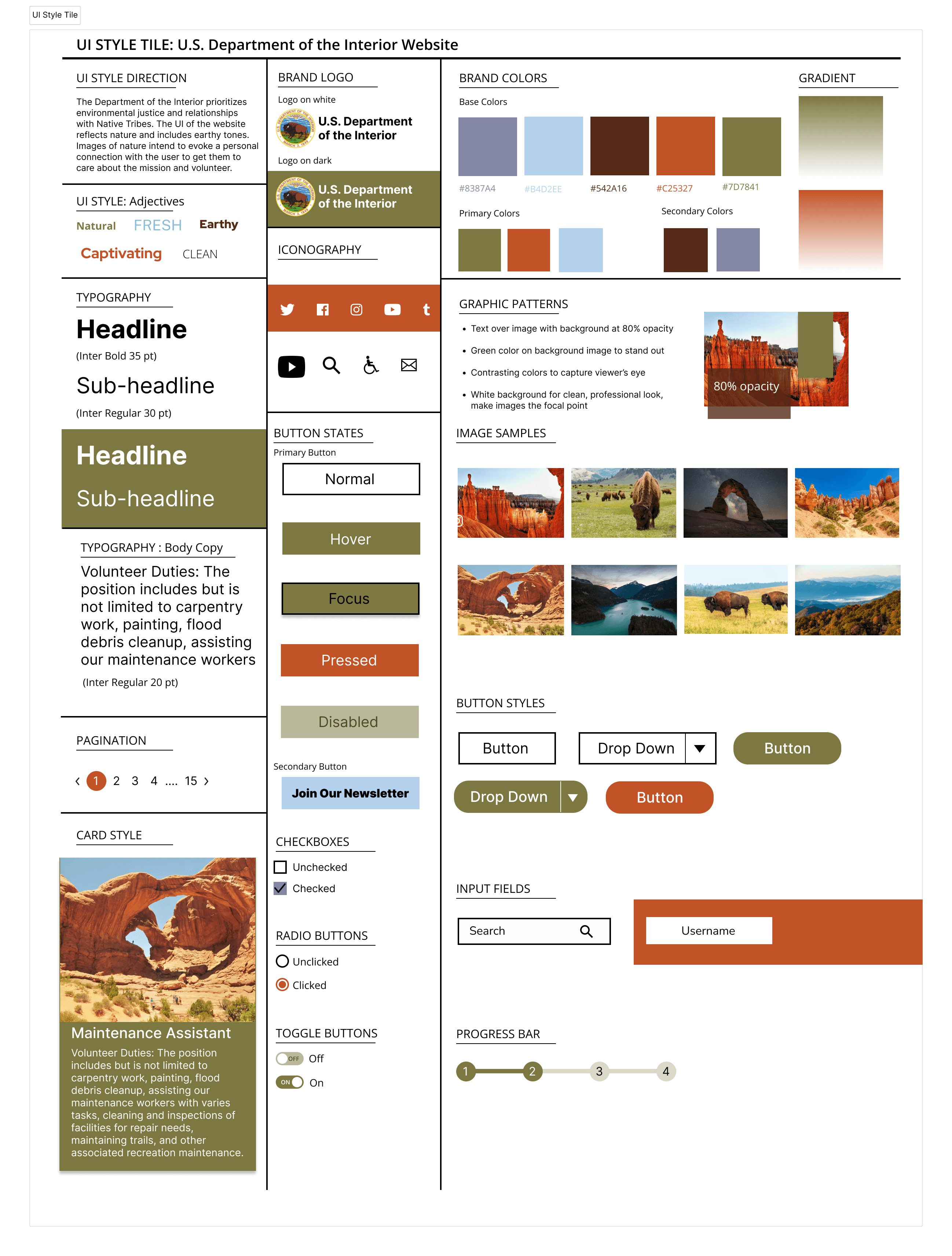
Spending a lot of time on the UI style tile helped me visualize the website redesign and ensure that things stay consistent. I enjoyed defining style adjectives like “natural”, “earthy”, “clean” because it lead me to make design decisions such as keeping some of the background white for the website which I also highlighted in the “Graphic Patterns” section of the style tile.
A/B Testing
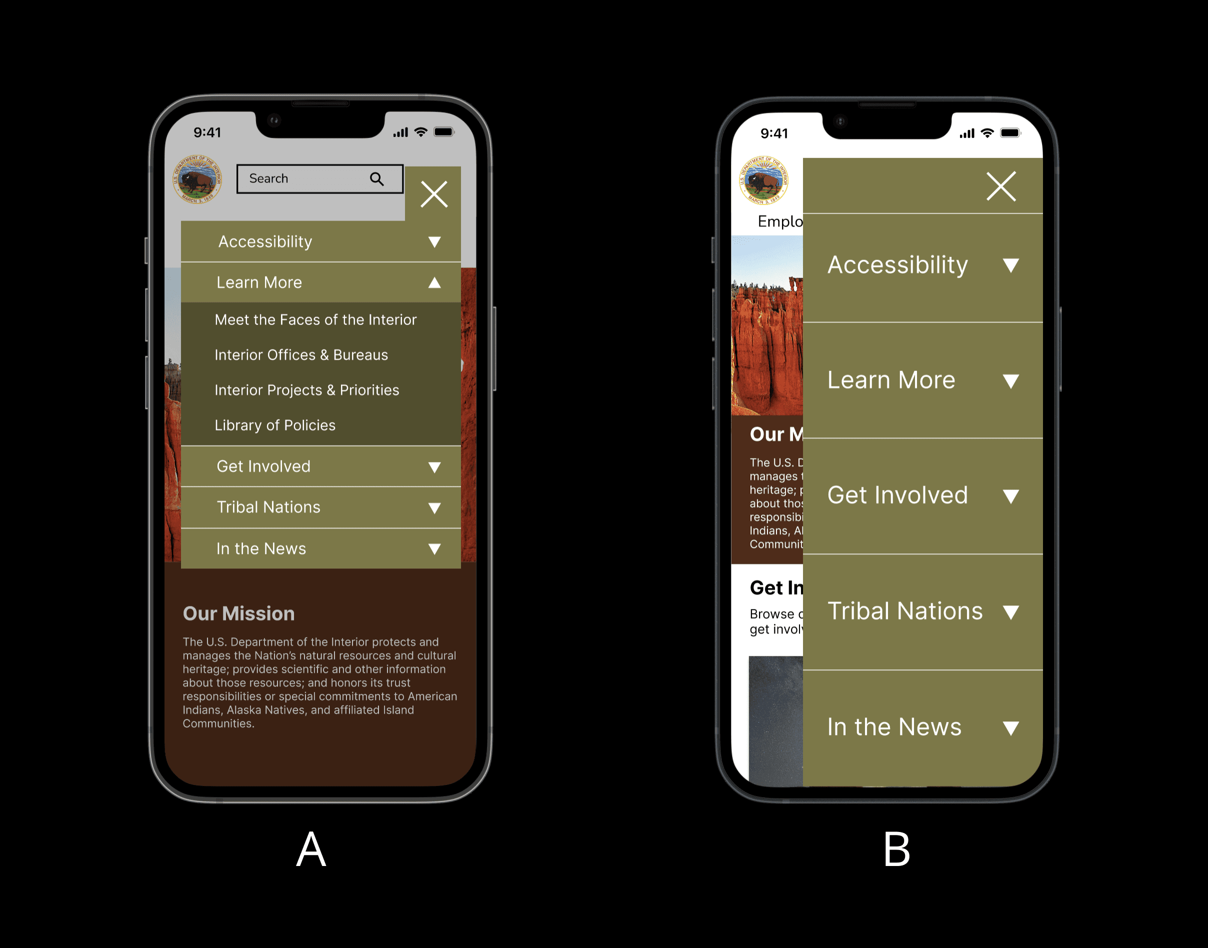
When creating the mobile prototype, I had to rethink the navigation menu and how it would display on a smaller screen. I created two different variations and conducted five A/B tests to determine which menu should be in the final high-fidelity prototype.
My testings confirmed my hypothesis that version A made more sense. Five out of five users chose A.
Final Prototypes
After conducting user testings, I was ready to complete the final mockups of the new, improved Department of the Interior website for both mobile and desktop.
Final Thoughts
Throughout this project, I learned a lot of valuable skills when it comes to UI design. One of my main takeaways is to really take the time in all steps of the process. Rushing through steps like card sorting will only add more work later on. It’s important to work diligently to create a successful website that makes sense to the user.
Overall, my research and testings when redesigning the website for the Department of the Interior confirmed that people need simple solutions. If there is an overwhelming amount of information, a lot of users feel discouraged. I really enjoyed creating the visual design of the DOI website to make the information more digestible and scannable.
For future opportunities, I would work on redesigning additional pages on the website especially the volunteer page to make it more user-friendly and encourage people to get involved.

